When working with a new brand or idea your logo is almost always the first port of call. It needs to represent who you are and what you are doing, so its important to do it right.
There are many things to take into consideration when establish your idea/brands identity, so over the next few blogs the team from Monkey House Media will speak specifically about what some of those are.
We are going to start with – how to choose a colour scheme for your logo/brand.
I recently read a great article by Martin Christie on www.creativebloq.com. He makes some great points about colour selection;
The human mind is highly responsive to visual stimuli, and colour is one of the major defining factors in that response. On both a conscious and subconscious level, colours convey meaning – not only in the natural world but also within the artifice of our culture. Graphic Designers need to harness the power of colour psychology to bring resonance to their designs – and in no field is this more important than that of logo design.
The use of colour can bring multiple layers of meaning, from primitive responses based on millions of years of evolved instinct to the complex associations we make based on learned assumptions. Companies can use these responses to underline and accent their branding messages.
What different colours mean
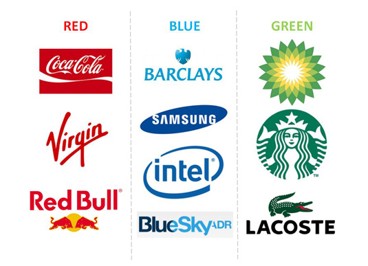
Big brands pick their colours carefully
Every colour, including black and white, has implications for logo design. You need to pick your colours carefully to enhance specific elements of the logo and bring nuance to your message with the use of shade and tone.
In general terms, bright and bold colours are attention-grabbing but can appear brash. Muted tones convey a more sophisticated image, but run the risk of being overlooked. More specifically, particular meanings are ascribed to different colours in society…
- Red implies passion, energy, danger or aggression; warmth and heat. It has also been found to stimulate appetite, which explains why it is used in so many restaurants and food product logos. Choosing red for your logo can make it feel more dynamic.
- Orange is often see as the colour of innovation and modern thinking. It also carries connotations of youth, fun, affordability and approachability.
- Yellow requires cautious use as it has some negative connotations including its signifying of cowardice and its use in warning signs. However it is sunny, warm and friendly and is another colour that is believed to stimulate appetite.
- Green is commonly used when a company wishes to emphasise their natural and ethical credentials, especially with such products as organic and vegetarian foods. Other meanings ascribed to it include growth and freshness, and it’s popular with financial products too.
- Blue is one of the most widely used colours in corporate logos. It implies professionalism, serious mindedness, integrity, sincerity and calm. Blue is also associated with authority and success, and for this reason is popular with both financial institutions and government bodies.
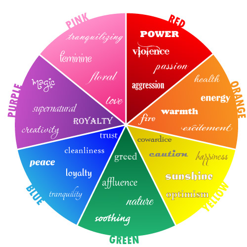
This diagram shows themes commonly associated with particular colours
- Purple speaks to us of royalty and luxury. It has long been associated with the church, implying wisdom and dignity, and throughout history it has been the colour of wealth and riches.
- Black is a colour with a split personality. On the one hand it implies power and sophistication, but on the other hand it is associated with villainy and death. More mundanely, most logos will need a black and white version for use in media in which colour is not available – and there is currently a trend for bold monochrome logos and word marks.
- White is generally associated with purity, cleanliness, simplicity and naiveté. In practical terms, a white logo will always need to stand in a coloured field to make it show up on a white background. Many companies will choose to have a coloured version and a white version of their logos; for example, the Coca-Cola word mark appears in white on its red tins and brown bottles but is used in red when needed on a white background.
- Brown has masculine connotations and is often used for products associated with rural life and the outdoors.
- Pink can be fun and flirty, but its feminine associations means it is often avoided for products not specifically targeted at women.
These associations are not rigid rules, of course, but they’re worth keeping in mind as you make your colour choices. Remember that the overall impact of your logo design will depend not on the colours themselves but upon how these interact with the shapes and text.[/vc_column_text][vc_separator color=”green” style=”dashed” el_width=”80″][vc_column_text]So there you have it guys, the first step to creating your brand. Keep an eye out for our next few blogs where we’ll explore other elements required to visually represent your brand/idea.